How do you make complex information more digestible for students? Infographics are a fantastic way to help students visualize information, and they are likely to come across infographics in digital spaces as consumers, too. Infographics combine visuals with concise text to help students grasp big ideas quickly.
When I host workshops and webinars for educators about using AI tools in their classrooms, I often mention how you can tackle items on your “to do list” and your “wish list.” Making an infographic might not be on your list of things you have to get done by the end of the day, but it certainly could be a wish list item. You might have an idea for an infographic that would help students better understand a topic, and in the past it just wouldn’t be something you could easily make. Now, with the right AI tools, you can move from a rough idea to a polished visual in just a few minutes.
Today on the blog, I’m excited to share some quick tips for creating your own classroom infographics that are tailored to your curriculum goals. You can leverage Artificial Intelligence (AI) to create infographics on just about any topic you can think of. Let’s take a look at a few tools, strategies, and specific prompts for making infographics with AI!
Why might you create classroom infographics?
We know that visual content is incredibly powerful for learning. An infographic can map out a complex process in a science classroom or help summarize important moments in a historical event.
AI makes this process accessible to everyone, regardless of their design background. You provide the ideas and the context, and the AI handles the heavy lifting of layout and design.
When students see a well-structured infographic, it can help them focus on the core concepts without being overwhelmed by a wall of text. This is particularly helpful for visual learners, multilingual learners, and students who need extra scaffolding. You are also preparing students to consume infographics as readers in digital and print spaces by introducing this type of media in your classroom.
Classroom Infographics and EdTech Essentials
In the second edition of my book EdTech Essentials, I include a section on infographics and some strategies for introducing them to students. Here’s a quick excerpt from page 89:
“An infographic is a popular medium featured in both print and digital formats. It can help students represent their thinking with visuals including a combination of icons, images, and text set in a thematic color palette. As a visual representation of information, an infographic lends itself well to many types of student learning experiences.
It pushes students to think about the organization of their information within a graphic, how to communicate information to an audience, and how data points are an important part of telling a story about a topic. Students can use infographics to represent information they have been given (e.g., a list of data points from the U.S. Geological Survey), data they have found through their own research, and results they have gathered through surveys.
Infographics require students to go beyond the surface level of information and organize facts and data into a visual format. This type of student product requires critical thinking and can incorporate collaborative opportunities such as peer feedback. You might ask students to use a template you have created and shared with them, search for a template to modify, or start from scratch.”
If you want to grab a copy, check out this collection of my books on Amazon. If you already have a copy of the book, download the study guide for free right here.

Must-Try AI Infographic Generators
There are several tools available to teachers that can help you build infographics. Here is a list of a few favorites to explore
Nano Banana (via Gemini)
This is the latest image generation model from Google. Nano Banana is particularly good at understanding complex layouts and rendering legible text within your graphics. I’ve really grown to appreciate how powerful Gemini is over the past few months, and their image generation technology is definitely the first place I would go to try making an infographic.
ChatGPT’s Image Tool
Just like Gemini, ChatGPT has come a long way with image creation.I don’t think their technology is quite as strong as what you’ll find inside of Gemini, but it is worth taking a look at if you’re already a ChatGPT user. You can ask for an image like an infographic and follow up with revisions. It’s not always perfect, but it can help you gather ideas you could take to another design tool.
NotebookLM
If you’re already using NotebookLM, I would start here when creating an infographic. This tool has the ability to generate conceptual visuals directly from your uploaded sources. If you have a long PDF or a collection of research notes, NotebookLM can synthesize that data into a structured format. The infographic generator in NotebookLM lets you decide how detailed you want your infographic to be, the shape of the infographic, and even lets you add some extra details so your creation gets closer to your vision.
Canva Magic Tools
Canva has integrated AI throughout the platform to support you throughout the design process. You can type a simple query, and it will auto-generate designs that fit your description. Since it is built into the Canva ecosystem, you can easily customize the final product with your own brand colors and fonts.
Google Slides (Beautify This Slide)
For a quick classroom update, the Gemini integration in Google Slides is very convenient. You can use the “Beautify this slide” feature to generate an infographic image directly on your slide. It uses the content of your existing presentation to inform the design. So, for example, if you already have some data on your slide, it can create a visual that goes along with that data, basically making you an infographic on the spot. I’ve modeled this live in workshops and webinars and have consistently been impressed by the results. This tool in Google Slides isn’t available for everyone, so if you don’t see it today, keep on the lookout for it.
Extra Tips for Making Classroom Infographics with AI
Working with AI is a collaborative process. To get the best results, you’ll want to be intentional with your prompts. Here are a few tips to keep in mind as you start creating.
Specify Your Color Palette
AI can sometimes choose colors that feel a bit overwhelming. By asking for a “muted, professional blue and gray palette” or “bright, primary colors,” you ensure the visual tone matches your goals. Consistent colors help make the information feel cohesive and organized.
Identify the Audience
A graphic designed for a group of kindergarteners should look very different from one made for a high school AP History class. Tell the AI who the infographic is for so it can adjust the complexity of the visuals and the level of any text it includes.

Manage Your Expectations on Text
It is important to understand that text on images can sometimes be limited. While models like Nano Banana Are definitely impressive, AI still occasionally makes mistakes with long sentences. Try not to get frustrated if the first version isn’t perfect.
5 Prompt Examples for an AI Infographic Generator
To help you get started, I have a handful of prompts to try out in your AI infographic generator of choice. I’ve used all of these examples with Gemini’s Nano Banana. But you could try it with any tool that you like.
Notes: Before copy and pasting the prompt, press the Tools button and choose “Create an Image.” You want to fact-check the output, as you might see in my examples, it doesn’t always produce perfect content.
Here are five prompts you can copy and adapt for your classroom:
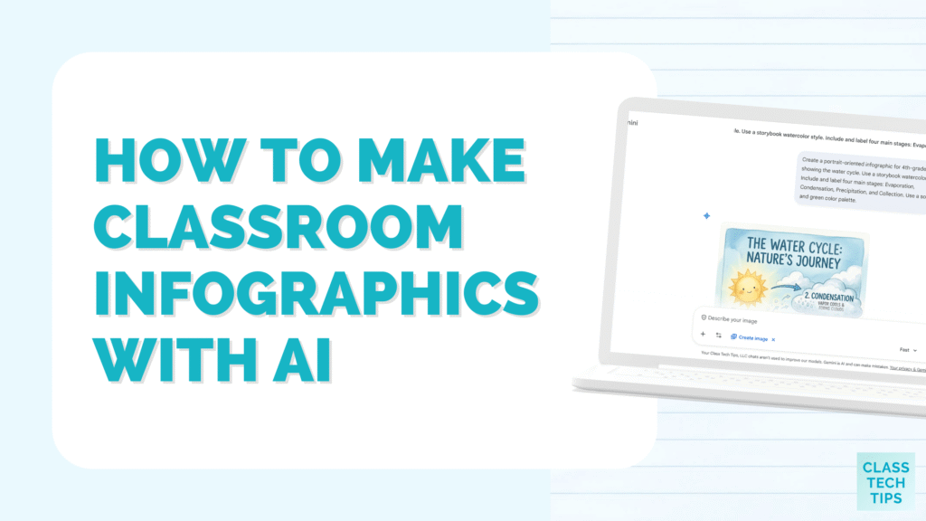
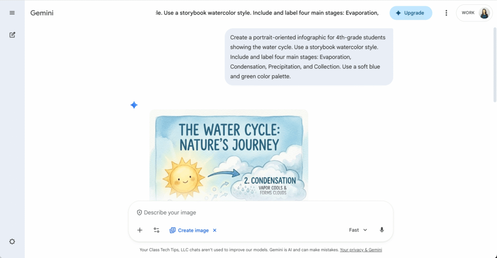
The Water Cycle
“Create a portrait-oriented infographic for 4th-grade students showing the water cycle. Use a storybook watercolor style. Include and label four main stages: Evaporation, Condensation, Precipitation, and Collection. Use a soft blue and green color palette.”
Parts of a Plant Cell
“Generate a 3D infographic of a plant cell. Use a vintage poster style with muted colors. Label the nucleus, cell wall, and chloroplasts clearly with a bold sans-serif font. The layout should be a central diagram with lines pointing to descriptions.”
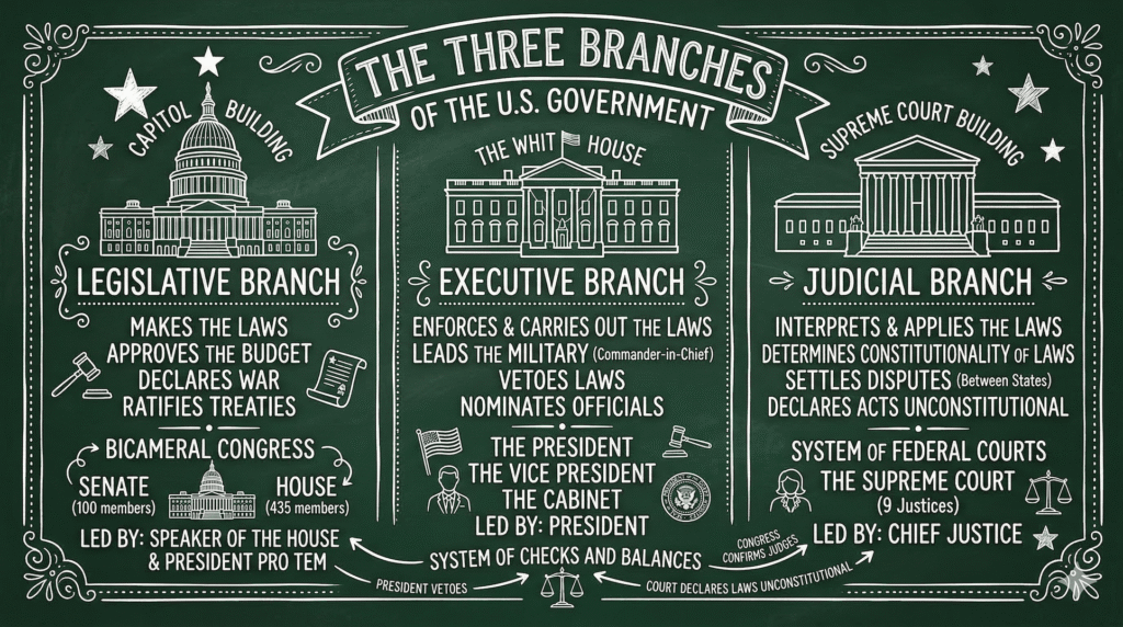
The Three Branches of Government
“Design a landscape layout, chalkboard art style infographic showing the Legislative, Executive, and Judicial branches of the US Government. Use white lines on a dark green background. Place each branch in a separate column with a simple icon representing each building.”
Industrial Revolution Timeline
“Create a horizontal timeline infographic for middle schoolers about the Industrial Revolution. Make it look like a graphic novel with high contrast. Include four key dates and inventions. The background should look like aged parchment paper.”

Plot Diagram
“Generate an infographic for a high school English class showing a standard plot diagram. Use a blueprint style with white lines on a blue background. Label the stages: Exposition, Rising Action, Climax, Falling Action, and Resolution. Include a small mountain-shaped graph to represent the tension.”
Ready to start making classroom infographics with AI? Whether you’re summarizing a science lab or mapping out a literary timeline, these tools provide a powerful platform to bring your ideas to life!